Python Sea Ice Spiral#
Software requirements:
Python 3
Xarray
Numpy
python-cdo
Matplotlib
Example script#
arctic_death_spiral.py
#!/usr/bin/env python
# coding: utf-8
'''
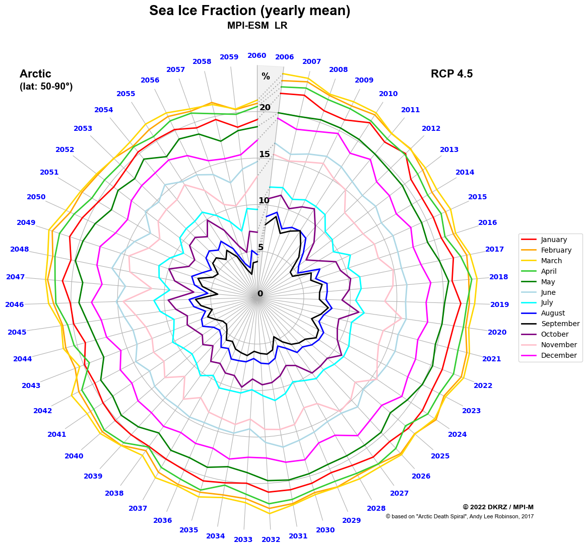
DKRZ example
Sea Ice Spiral (or Arctic Death Spiral)
Plot yearly seaIce fraction similar to the spiral plot based on the
`Arctic Death Spiral of Andy Lee Robinson (2017)` from the CMIP5
Sea Ice Area Fraction.
Data: CMIP5, MPI-ESM LR
Scenario: RCP 4.5
Variable: sic
(Sea Ice Area Fraction, fraction of grid cell
covered by sea ice in %)
Region: Arctis, 50-90°N
-------------------------------------------------------------------------------
2022 copyright DKRZ licensed under CC BY-NC-SA 4.0
(https://creativecommons.org/licenses/by-nc-sa/4.0/deed.en)
-------------------------------------------------------------------------------
'''
import os
import numpy as np
import xarray as xr
import matplotlib.pyplot as plt
from cdo import *
cdo = Cdo()
def main():
# Input data file
icefile = '../../data/sic_OImon_MPI-ESM-LR_rcp45_r1i1p1_200601-230012.nc'
# Data variable
#
# The variable name of **Sea Ice Area Fraction** is **sic**.
varname = 'sic'
# Extract Arctic data
#
# Extract the years 2006 to 2060 and extract the Arctic region 50-90°N
# from the input data file.
# In this case, we store the result of the CDO call to an xarray.Dataset.
sel_years = 55
ds = cdo.fldmean(input='-sellonlatbox,-180.0,180.0,50.0,90.0 '+\
'-seltimestep,1/'+str(sel_years*12)+\
' '+icefile,
options='-r --reduce_dim',
returnXDataset=True)
# Extract data by month
#
# Extract the data for each month for all years and assign it to
# seperate variables.
# The data has to be reversed because Matplotlib will draw the data on
# polar plots counterclockwise per default, but we want to have it
# clockwise.
month_ind = ds.groupby('time.month').groups
sic_jan = ds.isel(time=month_ind[1]).sic[::-1]
sic_feb = ds.isel(time=month_ind[2]).sic[::-1]
sic_mar = ds.isel(time=month_ind[3]).sic[::-1]
sic_apr = ds.isel(time=month_ind[4]).sic[::-1]
sic_may = ds.isel(time=month_ind[5]).sic[::-1]
sic_jun = ds.isel(time=month_ind[6]).sic[::-1]
sic_jul = ds.isel(time=month_ind[7]).sic[::-1]
sic_aug = ds.isel(time=month_ind[8]).sic[::-1]
sic_sep = ds.isel(time=month_ind[9]).sic[::-1]
sic_oct = ds.isel(time=month_ind[10]).sic[::-1]
sic_nov = ds.isel(time=month_ind[11]).sic[::-1]
sic_dec = ds.isel(time=month_ind[12]).sic[::-1]
# Minimum/maximum/increment of data
#
# The minimum value 0 is the center of the circle (radius=0) and
# the maximum is the radius of the outer circle.
valMin = 0
valMax = 25
valInt = 5
circleinc = valInt #-- circle (radius) increment
ncircles = valMax/circleinc #-- number of circles
# Define 12 colors
#
# We want to use a different color for each month.
colors = ['red', 'orange', 'gold', 'limegreen', 'green', 'lightblue',
'cyan', 'blue', 'black', 'purple', 'pink', 'magenta']
# Get years
#
# Here, we do not need to reverse the years values because we tell
# Matplotlib later to use the theta direction clockwise.
years = sic_jan.time.dt.year.values
# Radius and angel
#
# - the radii of the line points are defined by the data itself
# (= y-axis)
# - the angles (theta) of the data points depend on the number of
# data values (x-axis)
theta = np.linspace(0, 2*np.pi, len(years), endpoint=False)
dtheta = theta[1]-theta[0]
# Define dictionary containing the month names and the associated data
# To make the plotting part more convenient later, we put the name and
# data of each month in a dictionary.
mon_dict = {'January':sic_jan,
'February':sic_feb,
'March':sic_mar,
'April':sic_apr,
'May':sic_may,
'June':sic_jun,
'July':sic_jul,
'August':sic_aug,
'September':sic_sep,
'October':sic_oct,
'November':sic_nov,
'December':sic_dec}
# Create the plot
#
# Now, every thing we need is set and we can create the line plot with
# polar projection.
plt.switch_backend('agg')
fig = plt.figure(figsize=(12,12))
ax = fig.add_subplot(projection='polar', facecolor='white')
#-- add annotations
plt.suptitle('Sea Ice Fraction (yearly mean)',
fontname='Arial', fontsize=20, weight='bold')
plt.title('MPI-ESM LR', y=1.07,
fontname='Arial', fontsize=14, weight='bold')
fig.text(0.12, 0.86, 'Arctic',
fontname='Arial', fontsize=16, weight='bold')
fig.text(0.12, 0.84, '(lat: 50-90°)',
fontname='Arial', fontsize=14, weight='bold')
fig.text(0.8, 0.86, 'RCP 4.5',
fontname='Arial', fontsize=16, weight='bold')
plt.figtext(0.97, 0.145,
'© 2022 DKRZ / MPI-M',
fontname='Arial', fontsize=10, weight='bold', ha='right')
plt.figtext(0.97, 0.13,
'© based on "Arctic Death Spiral", Andy Lee Robinson, 2017',
fontname='Arial', fontsize=8, ha='right')
#-- draw the data for each month and connect the end point with the
#-- start point with dotted gray line
for i,mon in enumerate(mon_dict):
ax.plot(theta, mon_dict[mon],
color=colors[i],
linewidth=2,
label=mon)
ax.plot([theta[-1],theta[0]], [mon_dict[mon][-1], mon_dict[mon][0]],
color='black',
alpha=0.3,
linestyle=':',
linewidth=1.5)
#-- use years instead angles (theta) as x-tick labels
#-- set_xticks must be set to use set_xticklabels
ax.set_xticks(theta)
ax.set_xticklabels([str(yyyy) for yyyy in years],
c='blue', fontsize=10, fontweight='bold')
#-- move 0° to top and draw the angles clockwise
ax.set_theta_zero_location('N')
ax.set_theta_direction(1)
#-- move y-tick labels also to 'N'
ax.set_rlabel_position(0)
#-- don't draw the outer circle
ax.spines['polar'].set_visible(False)
#-- draw gray 'pie' segment to emphasize annotation
ax.fill_between(np.linspace(theta[-1], theta[-1]+dtheta, 2,
endpoint=True),
valMin, valMax, color='black', alpha=0.05, zorder=0)
#-- y-tick settings
ax.set_ylim(valMin, valMax)
#-- set_yticks must be set to use set_yticklabels
ax.set_yticks(np.arange(valMin, valMax, step=valInt))
ax.set_yticklabels(np.arange(valMin, valMax, step=valInt),
fontsize=12, fontweight='bold',
va='bottom', ha='left', x=-0.01)
plt.text(theta[0]-dtheta/2, 23.5, '%',
fontname='Arial', fontsize=14, fontweight='bold', ha='right')
#-- add legend
ax.legend(loc='center', bbox_to_anchor=(1.13, 0.5))
#-- write plot to PNG file
plt.savefig('plot_arctic_death_spiral_py.png',
bbox_inches='tight',
facecolor='white',
dpi=100)
if __name__ == '__main__':
main()
Plot result#