Python Hovmoeller diagram#
Software requirements:
Python 3
numpy
xarray
matplotlib
cartopy
Example script#
Hovmoeller_diagram_with_additional_map.py
#!/usr/bin/env python
# coding: utf-8
'''
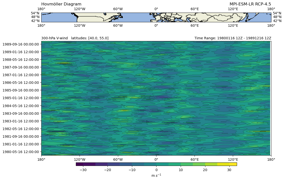
DKRZ example
Hovmöller diagram with additional map
A Hovmöller diagram is often used for meterological data. The diagram
shows the contours of a spatial variable in time and space:
x-axis: longitude or latitude
y-axis: time
Here for demonstration purposes, we use the variable northward wind, get
the data slice along a specified range of latitudes (40° - 55°) and plot
it against time.
Content
- read netCDF file
- extract slices
- convert pressure levels to height
- create a Hovmöller diagram
- add a map on top of the plot
- save to PNG
-------------------------------------------------------------------------------
2022 copyright DKRZ licensed under CC BY-NC-SA 4.0 <br>
(https://creativecommons.org/licenses/by-nc-sa/4.0/deed.en)
-------------------------------------------------------------------------------'''
import xarray as xr
import numpy as np
import matplotlib.pyplot as plt
import cartopy.crs as ccrs
import cartopy.feature as cfeature
def main():
plt.switch_backend('agg')
# Read the CMIP5 atmos historical dataset of the northward wind.
infile = '../../data/va_Amon_t1.nc'
ds = xr.open_dataset(infile)
# The grid of the data contains longitudes from 0° to 360°, but we want to
# have them from -180° to 180°.
ds = ds.assign_coords(lon=(((ds.lon + 180) % 360) - 180)).sortby('lon')
# Select variable **va** from dataset and convert the pressure levels from
# Pa to hPa, and overwrite plev in the dataset.
vnwind = ds.va
levels = ds.plev / 100
levels.attrs['units'] = 'hPa'
vnwind['plev'] = levels
# Select the latitude range to be used and select one pressure level.
lat_slice = [40., 55.]
sel_lev = 300
# Next, get the slices of the data.
data = vnwind.sel(plev=sel_lev,
lat=lat_slice,
method='nearest')
# Compute the weights and the weighted mean over latitude dimension.
weights = np.cos(np.deg2rad(data.lat))
weights.name = "weights"
data_weighted = data.weighted(weights)
data_weighted_mean = data_weighted.mean('lat')
data_weighted_mean.name = 'va'
# Create datetime objects
vtimes = vnwind.time.values.astype('datetime64[ms]').astype('O')
# Create the Hovmöller plot and add a small map of the region above it.
projection = ccrs.PlateCarree()
fig = plt.figure(figsize=(12, 10), constrained_layout=False)
# define space for the two plots
gs = fig.add_gridspec(nrows=4, ncols=1, hspace=0)
#-- create the small upper map
ax1 = plt.subplot(gs[0, 0], projection=projection)
ax1.set_extent([-180., 180., lat_slice[0], lat_slice[1]],
crs=ccrs.PlateCarree())
ax1.add_feature(cfeature.LAND)
ax1.add_feature(cfeature.OCEAN)
ax1.add_feature(cfeature.BORDERS)
ax1.add_feature(cfeature.COASTLINE)
ax1.gridlines(draw_labels=True, lw=0.01,crs=ccrs.PlateCarree())
plt.title(u'Hovmöller Diagram', loc='left')
plt.title('MPI-ESM-LR RCP-4.5', loc='right')
#-- create lower Hovmoeller diagram
clevs = np.arange(-30, 31, 5)
ax2 = fig.add_subplot(gs[1:, 0], sharex=ax1)
cf = ax2.contourf(vnwind.lon.values, vtimes, data_weighted_mean,
clevs,
cmap='viridis',
extend='both')
cs = ax2.contour(vnwind.lon.values, vtimes, data_weighted_mean,
clevs,
colors='k',
linewidths=0.25)
cbar = plt.colorbar(cf,
orientation='horizontal',
pad=0.05,
shrink=0.7,
aspect=50,
extendrect=True)
cbar.set_label('m $s^{-1}$')
ax2.set_xticks([-180, -120, -60, 0, 60, 120, 180])
ax2.set_xticklabels([u'180\N{DEGREE SIGN}', u'120\N{DEGREE SIGN}W',
u'60\N{DEGREE SIGN}W', u'0\N{DEGREE SIGN}',
u'60\N{DEGREE SIGN}E', u'120\N{DEGREE SIGN}E',
u'180\N{DEGREE SIGN}'])
ax2.set_yticks(vtimes[4::8])
ax2.set_yticklabels(vtimes[4::8])
plt.title(str(sel_lev)+'-hPa V-wind latitudes: '+str(lat_slice),
loc='left',
fontsize=10)
plt.title('Time Range: {0:%Y%m%d %HZ} - {1:%Y%m%d %HZ}'.format(vtimes[0], vtimes[-1]),
loc='right',
fontsize=10)
plt.savefig('plot_hovmoeller_2.png',
bbox_inches='tight',
facecolor='white',
dpi=100)
if __name__ == '__main__':
main()
Plot result: