Python box and points plot#
Software requirements:
Python 3
matplotlib
cartopy
numpy
xarray
Example script#
quality_points_per_grid_cell.py
#!/usr/bin/env python
# coding: utf-8
'''
DKRZ example
Draw two plots, first plot is a box plot and the second shows the data using
filled circles which are sized by a quality variable.
In this example, we want to show another way to display the data of a variable
depending on another variable, assuming temperature depends on a quality factor
for each grid cell.
Content
- generate random temperature and quality data
- generate coordinates lat,lon and merge all to an Xarray dataset
- draw box plot of temperature data
- determine marker colors by temperature data
- determine marker size by quality data
- draw points plot
- draw grid lines by data coordinates lat/lon
- draw colorbar for temperature data
- draw a legend for quality data
-------------------------------------------------------------------------------
2022 copyright DKRZ licensed under CC BY-NC-SA 4.0
(https://creativecommons.org/licenses/by-nc-sa/4.0/deed.en)
-------------------------------------------------------------------------------
'''
import numpy as np
import xarray as xr
import matplotlib as mpl
import matplotlib.pyplot as plt
import cartopy.crs as ccrs
import cartopy.feature as cfeature
# Function draw_grid()
#
# The function takes the coordinate arrays and the map extent to draw grid lines.
def draw_grid(lon, lat, minlon, maxlon, minlat, maxlat):
for i in range(0,len(lat)):
plt.plot([minlon,maxlon],[lat[i],lat[i]],c='black', lw=1, transform=ccrs.PlateCarree(), zorder=3)
for j in range(0,len(lon)):
plt.plot([lon[j],lon[j]],[minlat, maxlat],c='black', lw=1, transform=ccrs.PlateCarree(), zorder=4)
# Function draw_temperature_colorbar()
#
# The function takes the colormap, variable minimum and maximum, levels, and units to draw a colorbar for the temperature data.
def draw_temperature_colorbar(cmap, vmin, vmax, levels, units='K'):
cb = plt.cm.ScalarMappable(cmap=cmap,norm=plt.Normalize(vmin=vmin, vmax=vmax))
cb.set_array([])
cbar = plt.colorbar(cb,
orientation='horizontal',
ticks=levels[::5],
boundaries=levels,
format='%0.0f',
shrink=0.8,
pad=0.04,
aspect=30)
plt.setp(cbar.ax.get_xticklabels()[::2], visible=False)
cbar.set_label('['+units+']')
# Function draw_quality_legend()
#
# The function takes the values for the marker labels and their scale factor to draw a legend for the quality data.
def draw_quality_legend(ax, mvalues, mscale):
from matplotlib.lines import Line2D
mvalues = mvalues[::-1]
labels = map(str, mvalues)
custom_points = []
for x in mvalues:
custom_points.append(Line2D([], [], color='gray', marker='o', markersize=x*mscale, linestyle='None'),)
ax.legend(custom_points,
labels,
title='Quality\n',
title_fontsize=16,
handleheight=5.,
loc='center left',
bbox_to_anchor=(1.07, 0.5),
frameon=False)
def main():
# Define area bounds (Germany)
#
# We want to display the rough area of Germany.
minlat = 47.0
maxlat = 55.0
minlon = 5.0
maxlon = 16.0
# Generate random data and coordinates
#
# Define the number of cells for the grid by the number of latitudes and longitudes.
nlat = 16
nlon = 22
# Generate the latitude and longitude arrays.
lat = np.linspace(minlat, maxlat,nlat)
lon = np.linspace(minlon, maxlon,nlon)
# Generate the random data for variable temperature.
vmin = 240.
vmax = 300.
np.random.seed(42)
temp = np.random.uniform(vmin, vmax, (nlat, nlon))
# Generate dummy data for quality.
minqual = 1
maxqual = 4
quality = np.floor(np.random.uniform(minqual, maxqual+0.5, (nlat,nlon)))
# Merge the variables lat, lon, temp, and quality to an Xarray dataset
ds = xr.Dataset({
'lat': xr.DataArray(
data = lat,
dims = ['lat'],
coords = {'lat': lat},
attrs = {'standard_name' : 'latitude',
'units' : 'degrees_north'
}
),
'lon': xr.DataArray(
data = lon,
dims = ['lon'],
coords = {'lon': lon},
attrs = {'standard_name' : 'longitude',
'units' : 'degrees_east'
}
),
'temp': xr.DataArray(
data = temp,
dims = ['lat', 'lon'],
coords = {'lat': lat, 'lon' : lon},
attrs = {'standard_name' : 'temperature',
'units' : 'K'
}
),
'quality': xr.DataArray(
data = quality,
dims = ['lat', 'lon'],
coords = {'lat': lat, 'lon' : lon},
attrs = {'standard_name' : 'quality',
'units' : 'value'
}
)
},
attrs = {'comment' : 'Dummy data over Germany'}
)
# Convert temp 2d array to 1d
temp1d = temp.flatten()
# Colors
#
# Choose a colormap and create a colors array that contains a color for each grid cell depending on its temperature value.
colormap = 'RdYlBu_r'
incr = 1.0
levels = np.arange(vmin, vmax, incr)
nlevs = len(levels)
ncells = len(temp1d)
cmap = plt.get_cmap(colormap, nlevs) #-- read the color map
cmaplist = [i for i in range(cmap.N)] #-- color bar indices
ncol = len(cmaplist) #-- number of colors
colors = np.zeros([ncells,4], np.float32) #-- assign color array for markers
#-- set color index of all values in between levels
for m in range(0,ncol-1):
vind = []
for i in range(0,ncells-2, 1):
if (temp1d[i] >= levels[m] and temp1d[i] < levels[m+1]):
colors[i,:] = cmap(cmaplist[m])
vind.append(i)
del vind
colors[np.where(temp1d <= vmin+incr),:] = cmap(cmaplist[0])
colors[np.where(temp1d >= vmax-incr),:] = cmap(cmaplist[ncol-1])
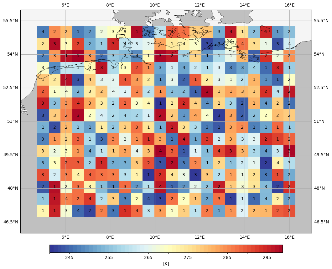
# Create the box plot
#
# Draw the temperature data within grid cells (box plot) and add the quality value for each cell.
plt.switch_backend('agg')
fig, ax = plt.subplots(figsize=(12, 12), subplot_kw=dict(projection=ccrs.PlateCarree()))
ax.gridlines(draw_labels=True)
ax.set_extent([minlon-1, maxlon+1, minlat-1, maxlat+1])
ax.add_feature(cfeature.LAND.with_scale('50m'), facecolor='silver')
ax.add_feature(cfeature.OCEAN, facecolor='whitesmoke')
ax.add_feature(cfeature.COASTLINE, linewidth=0.5)
pcm = ax.pcolormesh(lon, lat, temp, cmap=colormap, transform=ccrs.PlateCarree())
#-- add a color bar for temperature data
draw_temperature_colorbar(cmap, vmin, vmax, levels, units='K')
#-- add quality values
for i in range(0,len(lat)):
for j in range(0,len(lon)):
plt.text(lon[j], lat[i], '{}'.format(int(quality[i,j])), ha='center', va='center')
plt.savefig('plot_quality_points_per_grid_cell_1.png', bbox_inches='tight', facecolor='white', dpi=100)
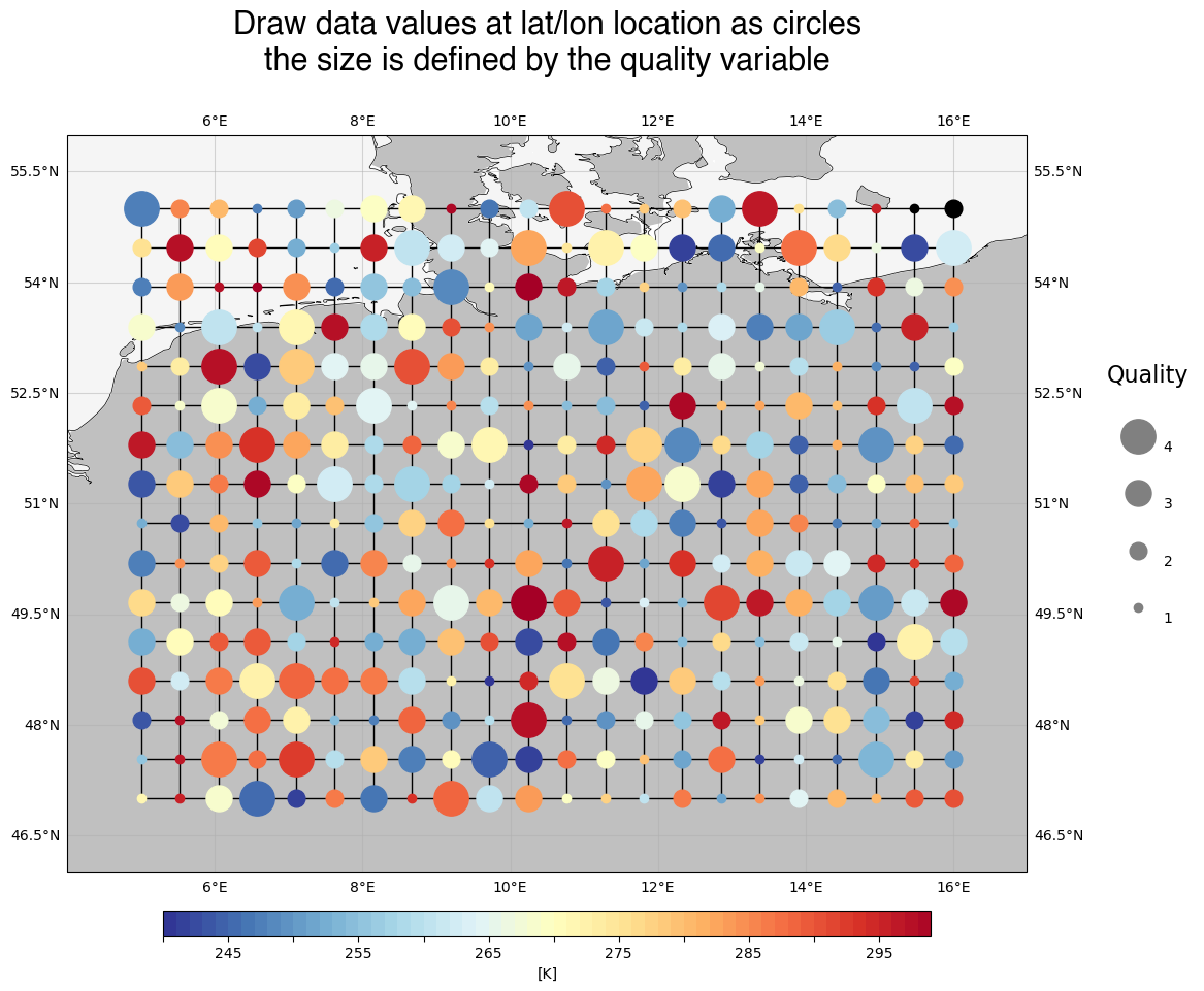
# Create the points plot
#
# Another kind to display the data from above is to draw the temperature values of the grid cells as colored points where the size of the points depends on the quality factor.
fig, ax = plt.subplots(figsize=(12, 12), subplot_kw=dict(projection=ccrs.PlateCarree()))
hfont = {'fontname':'Helvetica', 'fontsize':22}
plt.title('Draw data values at lat/lon location as circles\nthe size is defined by the quality variable\n',
**hfont)
ax.gridlines(draw_labels=True, alpha=0.5)
ax.set_extent([minlon-1, maxlon+1, minlat-1, maxlat+1])
ax.add_feature(cfeature.LAND.with_scale('50m'), facecolor='silver')
ax.add_feature(cfeature.OCEAN, facecolor='whitesmoke')
ax.add_feature(cfeature.COASTLINE, linewidth=0.5)
#-- draw grid lines from data coordinates
draw_grid(lon, lat, minlon, maxlon, minlat, maxlat)
#-- marker scale
mscale = 6
#-- draw markers
l = 0
for i in range(0,len(lat)):
for j in range(0,len(lon)):
plt.plot(lon[j], lat[i],
c=colors[l],
marker='o',
markersize=quality[i,j]*mscale,
transform=ccrs.PlateCarree(),
alpha=1.,
zorder=5)
l += 1
#-- add a color bar for temperature data
draw_temperature_colorbar(cmap, vmin, vmax, levels, units='K')
#-- draw legend for quality data
draw_quality_legend(ax, np.arange(quality.min(),quality.max()+1).astype(int), mscale)
#-- save the plot in PNG format
plt.savefig('plot_quality_points_per_grid_cell_2.png', bbox_inches='tight', facecolor='white', dpi=100)
if __name__ == '__main__':
main()
Plot result#