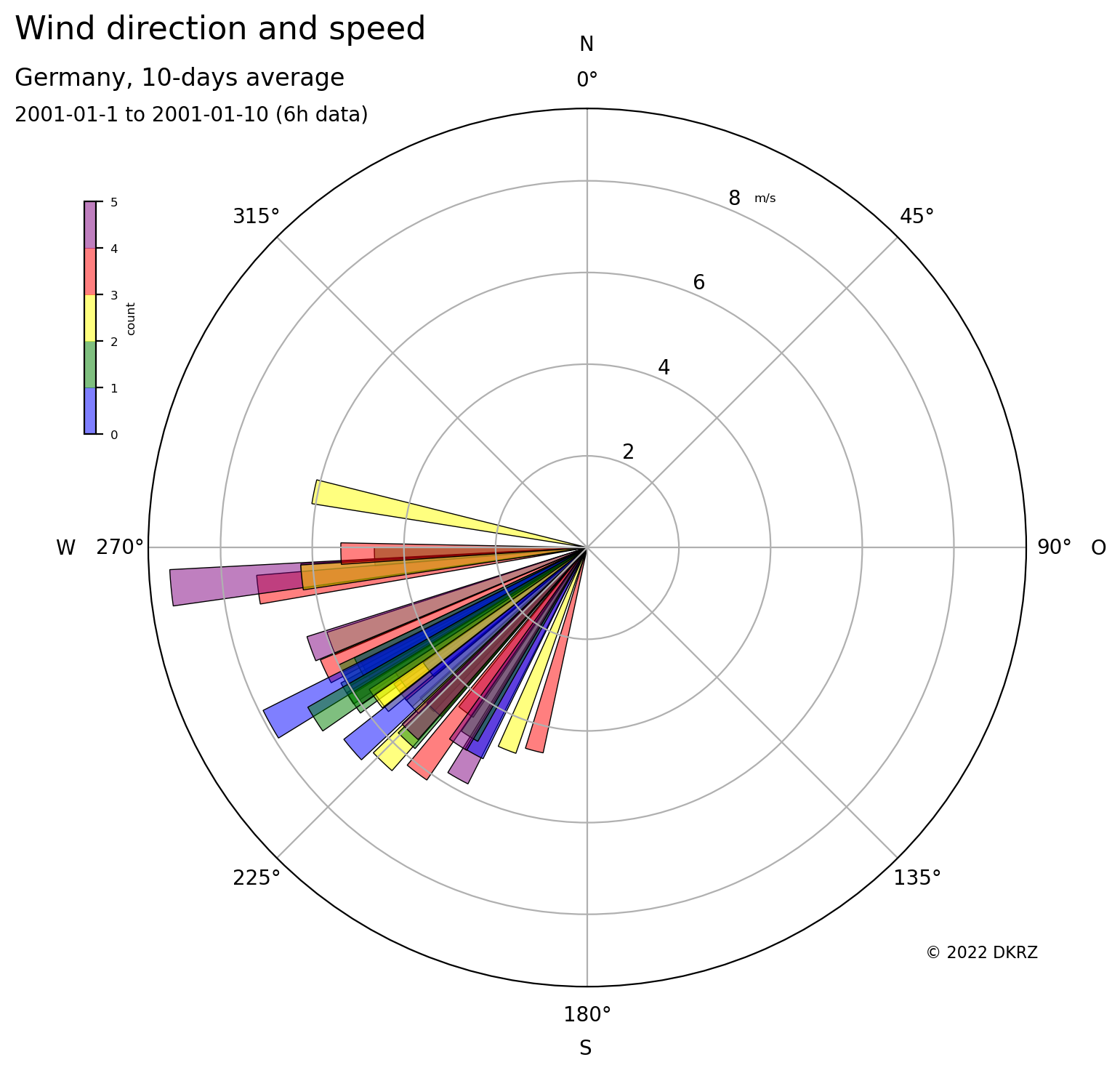
Python wind speed and direction plot colored by frequency#
Software requirements:
Python 3
xarray
numpy
matplotlib
Example script#
wind_dir_speed_circular_plot_colored_by_frequency.py
#!/usr/bin/env python
# coding: utf-8
'''
DKRZ example

This example demonstrates how to plot the 10-days wind direction and speed
average for Germany colored by the frequency.

Bar length:  wind speed
Bar color:   count

-------------------------------------------------------------------------------
2022 copyright DKRZ licensed under CC BY-NC-SA 4.0
               (https://creativecommons.org/licenses/by-nc-sa/4.0/deed.en)
-------------------------------------------------------------------------------
'''
import os
import xarray as xr
import numpy as np

import matplotlib as mpl
import matplotlib.pyplot as plt
from matplotlib import cm

def main():

    #-- Read the data set from file
    fname = '../../data/rectilinear_grid_2D.nc'

    ds = xr.open_dataset(fname)

    #-- Next, we want to extract a smaller region (northern Germany) to take a closer
    #-- look at the data there.
    #-- First, we create the mask using the dataset coordinates.
    mask = ((ds.coords['lat'] > 47.25)
          & (ds.coords['lat'] < 55.5)
          & (ds.coords['lon'] > 5.8)
          & (ds.coords['lon'] < 15))

    #-- Now, use the mask to set all values outside the region to missing value.
    u = xr.where(mask, ds.u10, np.nan)
    v = xr.where(mask, ds.v10, np.nan)

    #-- Compute the wind direction
    wind_dir = np.arctan2(v,u) * (180/np.pi) + 180.

    #-- Compute the wind speed (magnitude)
    wind_speed = np.sqrt(u**2 + v**2)

    #-- Compute the averages
    wind_diravg   = np.mean(wind_dir,   axis=(0,1))
    wind_speedavg = np.mean(wind_speed, axis=(0,1))

    #-- Set levels
    levels_min  =  0.0
    levels_max  = 10.0
    levels_step =  0.2
    levels      = np.arange(levels_min, levels_max, levels_step)

    #-- Count values by wind_speed
    counts, bin_edges = np.histogram(wind_speedavg, bins=levels)

    max_counts = counts.max()

    #-- Colormap definition
    colors = ['blue', 'green', 'yellow', 'red', 'purple']
    alpha = 0.5
    colors_rgba = np.zeros((len(colors),4), np.float32)

    for i in range(0,len(colors)):
        c = np.array(mpl.colors.to_rgba(colors[i]))
        colors_rgba[i,:] = c
        colors_rgba[i,3] = alpha

    cmap   = mpl.colors.ListedColormap(colors_rgba)
    bounds = range(0, len(colors)+1, 1)
    norm   = mpl.colors.BoundaryNorm(bounds, cmap.N)

    #-- The plot function `bar()` has to be used with the **polar projection** which
    #-- is set in the `subplots()` call. After drawing the bars, the color of each
    #-- bar is changed according to the wind speed.
    #-- Per default the angles are drawn counterclockwise with N at 3 o'clock,
    #-- that's why we have to set N to 0 deg at top and the theta direction to clockwise.
    #--
    #-- Furthermore, a colorbar, titles, and copyright text are added. The final plot
    #-- is written to a PNG file.

    #-- Define angles array
    theta_step = 5
    theta_num  = int(360/theta_step)
    theta_arr  = np.radians(wind_diravg)

    #-- bar width
    bwidth = (2*np.pi)/theta_num

    #-- initialize the figure and axis
    plt.switch_backend('agg')

    fig, ax = plt.subplots(subplot_kw={'projection': 'polar'})


    #-- plot the histogram bars using polar projection
    bars = ax.bar(theta_arr, wind_speedavg,
                  color=cmap.colors,
                  width=bwidth,
                  bottom=0.)

    #-- theta=0 set N at the top; theta increasing clockwise (= wind comes from)
    ax.set_theta_zero_location('N')
    ax.set_theta_direction(-1)

    #-- add a colorbar
    ax1 = fig.add_axes([0.09, 0.6, 0.01, 0.2], autoscalex_on=True)  #-- x,y,w,h

    cbar = fig.colorbar(mpl.cm.ScalarMappable(cmap=cmap, norm=norm),
                        cax=ax1,
                        boundaries=bounds,
                        ticks=bounds,
                        orientation='vertical')

    cbar.ax.tick_params(labelsize=6)
    cbar.set_label(label='count', size=6)

    #-- add geographic directions
    plt.gcf().text(0.50,  0.954, 'N', fontsize=10)
    plt.gcf().text(0.85,  0.484, 'O', fontsize=10)
    plt.gcf().text(0.50,  0.025, 'S', fontsize=10)
    plt.gcf().text(0.135, 0.485, 'W', fontsize=10)

    #-- add some text
    plt.gcf().text(0.02, 0.95,'Wind direction and speed', fontsize=12)
    plt.gcf().text(0.02, 0.9, 'Germany, 10-days average', fontsize=9)
    plt.gcf().text(0.02, 0.87,'2001-01-1 to 2001-01-10 (6h data)', fontsize=6)

    #-- add units to plot
    plt.figtext(0.65, 0.8, ds.u10.attrs['units'], ha="right", fontsize=6)

    #-- add copyright
    plt.figtext(0.85, 0.01, "© 2022 DKRZ", ha="right", fontsize=4)

    #-- save plot to PNG file
    plt.savefig('plot_wind_dir_speed_count_circular.png', bbox_inches='tight', dpi=200)


if __name__ == '__main__':
    main()
Plot result#