Python Germany warming stripes and anomaly bars#
Software requirements:
Python 3
numpy
pandas
scipy
matplotlib
Example script#
German_states_warming_stripes_plot_yearly_temperature_average.py
#!/usr/bin/env python
# coding: utf-8
'''
DKRZ example
Warming stripes plot
Most of us have already come across Ed Hawkins' depiction of the
'Warming Stripes'. In this example we show how to create this plot with
Python using the annual mean temperature data from the DWD.
The goal is to generate the Warming Stripes for a selected German state and
additionally to draw the anomalies below the plot for a better understanding.
Content
- read all states CSV data files and concat them to a single Pandas DataFrame
- use Rectangle and PatchCollection to generate the warmin stripes plot
- define a function to compute the running mean
- compute the climatology and the anomalies
- use pyplot.bar to create the anomalies plot
- attach both plots into one figure
Data
- 12 datasets containing the 16 German states temperature anomalies from
Deutscher Wetterdienst (German Weather Service), Climate Data Center (CDC)
https://www.dwd.de/DE/leistungen/zeitreihen/zeitreihen.html
Based on
- Ed Hawkins' 'Temperature changes around the world (1901-2018)'
https://showyourstripes.info/s/globe
-------------------------------------------------------------------------------
2023 copyright DKRZ licensed under CC BY-NC-SA 4.0
(https://creativecommons.org/licenses/by-nc-sa/4.0/deed.en)
-------------------------------------------------------------------------------
'''
import os
import numpy as np
import pandas as pd
import matplotlib.pyplot as plt
from matplotlib.patches import Rectangle
from matplotlib.collections import PatchCollection
from matplotlib.colors import ListedColormap
def main():
# Input files
data_dir = '../../data/'
input_files = ['Baden-Wuertenberg_Temperature_Anomaly_1881-2018_ym.txt',
'Bayern_Temperature_Anomaly_1881-2018_ym.txt',
'Berlin_Brandenburg_Temperature_Anomaly_1881-2018_ym.txt',
'Hamburg_Bremen_Niedersachsen_Temperature_Anomaly_1881-2018_ym.txt',
'Hessen_Temperature_Anomaly_1881-2018_ym.txt',
'Mecklenburg-Vorpommern_Temperature_Anomaly_1881-2018_ym.txt',
'Nordrhein-Westphalen_Temperature_Anomaly_1881-2018_ym.txt',
'Rheinland-Pfalz_Saarland_Temperature_Anomaly_1881-2018_ym.txt',
'Sachsen_Temperature_Anomaly_1881-2018_ym.txt',
'Sachsen-Anhalt_Temperature_Anomaly_1881-2018_ym.txt',
'Schleswig-Holstein_Temperature_Anomaly_1881-2018_ym.txt',
'Thueringen_Temperature_Anomaly_1881-2018_ym.txt']
input_files = [data_dir + f for f in input_files]
# Combine/concat data
#
# 1. read the state name which are not in the same order as their file names
# let us assume
# 2. read the data for each state
# 3. change the column name to the state name
# 4. concatenate the data
# 5. delete duplicated columns (Jahr)
#
# Each state file has a header of 24 lines describing the data followed by a
# column containing the year (Jahr) and a second column with the data value.
#
# For example the state file for 'Hamburg, Bremen, Niedersachsen':
#
# # Hamburg, Bremen, Niedersachsen
# #
# # Parameter Jahr Wert
# # Minimum [°C] 1940 6.9
# # Maximum [°C] 2014 10.8
# #
# # 30-jähriger Mittelwert [°C]
# # 1981-2010 9.3
# # 1971-2000 9.0
# # 1961-1990 8.6
# #
# # aktueller Wert [°C] 2018 10.7
# #
# # Abweichung vom Referenzzeitraum [K]
# # 1981-2010 1.4
# # 1971-2000 1.8
# # 1961-1990 2.1
# #
# # linearer Trend [K] 1881-2018 1.6
# #
# # aktuelle Platzierung (absteigend) 2018 2
# # aktuelle Platzierung (aufsteigend) 2018 137
# #
# # Gebietsmittel Jahr Wert
# 1881 7.5
# 1882 8.9
# 1883 8.4
# ...
for i,f in enumerate(input_files):
name = os.popen("head -1 "+f+" | tr -d '# \n'").read()
dfi = pd.read_csv(f, skiprows=range(0,23), usecols=['#', 'Gebietsmittel'], sep=' ')
dfi.columns = ['Jahr', name]
if i == 0:
df_all = dfi
else:
df_all = pd.concat([df_all, dfi], axis=1, join='inner')
df_all = df_all.loc[:,~df_all.columns.duplicated()]
# The new dataframe df_all:
#
# Jahr Baden-Wuerttemberg Bayern Brandenburg,Berlin Hamburg,Bremen,Niedersachsen Hessen Mecklenburg-Vorpommern Nordrhein-Westfalen Rheinland-Pfalz,Saarland Sachsen Sachsen-Anhalt Schleswig-Holstein Thueringen
# 0 1881 7.7 6.6 7.6 7.5 7.5 7.0 8.1 8.0 6.7 7.5 7.1 7.5
# 1 1882 8.1 7.3 9.0 8.9 8.2 8.5 9.0 8.6 8.1 8.8 8.8 8.8
# 2 1883 7.8 6.8 8.4 8.4 8.0 7.9 8.7 8.3 7.5 8.3 8.2 8.3
# 3 1884 8.4 7.5 9.1 9.1 8.6 8.7 9.4 9.0 8.2 8.9 8.9 8.9
# 4 1885 7.8 7.0 8.4 7.9 7.7 7.7 8.3 8.0 7.7 8.1 7.6 8.1
# ... ... ... ... ... ... ... ... ... ... ... ... ... ...
# 133 2014 10.1 9.6 10.7 10.8 10.3 10.2 11.0 10.7 10.1 10.7 10.5 10.7
# 134 2015 9.9 9.4 10.4 10.2 9.9 9.8 10.4 10.3 9.9 10.3 9.7 10.3
# 135 2016 9.3 8.9 10.0 9.9 9.4 9.6 10.1 9.8 9.4 10.1 9.6 10.1
# 136 2017 9.4 8.8 9.9 10.0 9.6 9.5 10.3 10.0 9.4 10.0 9.6 10.0
# 137 2018 10.4 9.9 10.8 10.7 10.5 10.2 11.0 10.9 10.3 10.9 10.2 10.9
#
# Time
#
# Set the time range and the 30-years reference time for the climatology.
start_year = df_all.Jahr[0]
end_year = df_all.Jahr[df_all.Jahr.count()-1]
ref_years = [1981, 2010]
# Select state
#
# Select the German state to be used, extract the data, and construct the plot
# file name.
# Here, we choose the state set **'Hamburg,Bremen,Niedersachsen'** but its up
# to you to choose another one.
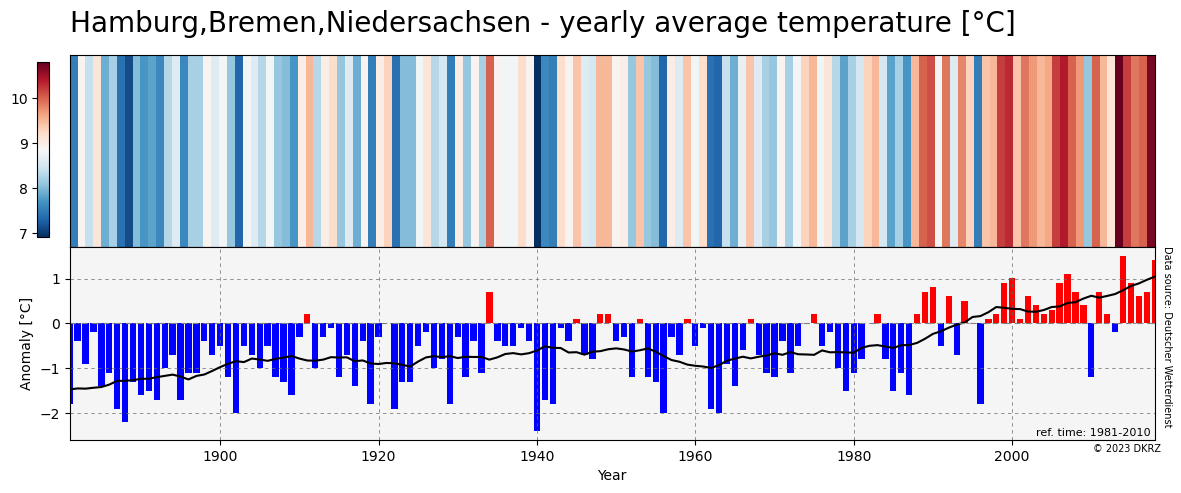
state = 'Hamburg,Bremen,Niedersachsen'
data = df_all.loc[:,state]
# Create the warming stripes plot
#
# Create a colored rectangle for each year. Add a colorbar just to see the value range better.
plt.switch_backend('agg')
fig = plt.figure(figsize=(16, 2))
ax = fig.add_axes([0, 0, 1, 1])
cmap = 'RdBu_r'
rect_coll = PatchCollection([Rectangle((y, 0), 1, 1) for y in range(start_year, end_year + 1)])
rect_coll.set_array(data)
rect_coll.set_cmap(cmap)
ax.add_collection(rect_coll)
ax.set_ylim(0, 1)
ax.set_xlim(start_year, end_year + 1)
ax.set_title(state, fontsize=20, loc='left')
cbar = plt.colorbar(rect_coll, pad=0.02)
plt.figtext(0.88, 0.05, 'Data source: Deutscher Wetterdienst',
rotation=270, fontsize=7)
plotfile1 = 'plot_'+state.replace(',', '_')+'_warming_stripes.png'
fig.savefig(plotfile1, bbox_inches='tight', facecolor='white')
# Function to calculate the running mean
#
# The Savitzky-Golay filter uses convolution process applied on an array for
# smoothing. The Python package scipy provide the function as shown in the
# next example.
import scipy.signal
def calc_running_mean(data, window_length=30, polyorder=3, mode='nearest'):
return scipy.signal.savgol_filter(data,
window_length,
polyorder,
mode='nearest')
# Compute the climatology and anomalies
climatology = df_all.loc[(df_all['Jahr'] >= ref_years[0]) &
(df_all['Jahr'] <= ref_years[1]),
state].mean()
anomaly = data - climatology
# Create the anomaly plot
fig = plt.figure(figsize=(16, 2))
ax = fig.add_axes([0, 0, 1, 1])
ax.set_facecolor('whitesmoke')
colors = ['red' if (value > 0) else 'blue' for value in anomaly]
xlabel = 'Year'
ylabel = 'Anomaly [°C]'
uppertitle = state
lowertitle = 'ref. time: 1981-2010'
ax.bar(df_all.Jahr, anomaly, color=colors)
ax.plot(df_all.Jahr, calc_running_mean(anomaly),
color='black',
linewidth=1.5)
plt.axhline(y=0., color='gray', linestyle=(0, (5, 5)), linewidth=0.8)
ax.grid(linestyle=(0, (5, 5)), linewidth=0.5, color='dimgray')
ax.set_xlim(start_year, end_year)
ax.set_xlabel(xlabel)
ax.set_ylabel(ylabel)
xmin, xmax = ax.get_xlim()
ymin, ymax = ax.get_ylim()
tx1 = ax.text(xmin+1.5, ymax-(ymax-ymin)*0.04,
uppertitle,
fontsize=16,
ha='left',
va='top')
tx2 = ax.text(xmax-0.5, ymin+(ymax-ymin)*0.01,
lowertitle,
fontsize=8,
ha='right',
va='bottom')
source = plt.figtext(1.005, 0.05,
'Data source: Deutscher Wetterdienst',
rotation=270,
fontsize=7)
# Create both plots
#
# Attach the anomaly plot below the warming stripes plot.
fig = plt.figure(figsize=(14, 5))
#-- define a 2 rows and 1 column grid (panel) for the subplots
gs = fig.add_gridspec(2,1, hspace=0)
#-- figure title
fig.suptitle(state+' - yearly average temperature [°C]',
x=0.125,
y=0.97,
ha='left',
fontsize=20)
#---- ax1
ax1 = fig.add_subplot(gs[0, 0])
rect_coll = PatchCollection([Rectangle((y, 0), 1, 1) for y in range(start_year, end_year + 1)])
rect_coll.set_array(data)
rect_coll.set_cmap(cmap)
ax1.add_collection(rect_coll)
ax1.set_ylim(0, 1)
ax1.set_xlim(start_year, end_year + 1)
ax1.yaxis.set_visible(False)
#---- ax 2
ax2 = fig.add_subplot(gs[1, 0])
xlabel = 'Year'
ylabel = 'Anomaly [°C]'
uppertitle = state
lowertitle = 'ref. time: 1981-2010'
colors = ['red' if (value > 0) else 'blue' for value in anomaly]
ax2.bar(df_all.Jahr, anomaly, color=colors)
ax2.plot(df_all.Jahr, calc_running_mean(anomaly), color='black', linewidth=1.5)
plt.axhline(y=0., color='gray', linestyle=(0, (5, 5)), linewidth=0.8)
ax2.set_facecolor('whitesmoke')
ax2.grid(linestyle=(0, (5, 5)), linewidth=0.5, color='dimgray')
ax2.set_xlim(start_year, end_year)
ax2.set_xlabel(xlabel)
ax2.set_ylabel(ylabel)
#-- attach text inside ax2 (anomaly plot)
xmin, xmax = ax2.get_xlim()
ymin, ymax = ax2.get_ylim()
tx2 = ax2.text(xmax-0.5, ymin+(ymax-ymin)*0.01,
lowertitle,
fontsize=8,
ha='right',
va='bottom')
#---- ax3
ax3 = fig.add_axes([0.102, 0.515, 0.008, 0.35])
cbar = plt.colorbar(rect_coll, cax=ax3, aspect=100)
ax3.yaxis.set_ticks_position('left')
#-- data source and copyright
plt.figtext(0.856, 0.087, '© 2023 DKRZ', fontsize=7)
plt.figtext(0.905, 0.14, 'Data source: Deutscher Wetterdienst',
rotation=270, fontsize=7)
#-- save figure as PNG file
plotfile2 = 'plot_'+state.replace(',', '_')+'_warming_stripes_plus_anomaly_bars.png'
fig.savefig(plotfile2, bbox_inches='tight', facecolor='white')
if __name__ == '__main__':
main()
Plot result#