Python multi-timeseries#
Software requirements:
Python 3
Xarray
matplotlib
Example script#
multi_timeseries.py
#!/usr/bin/env python
# coding: utf-8
''''
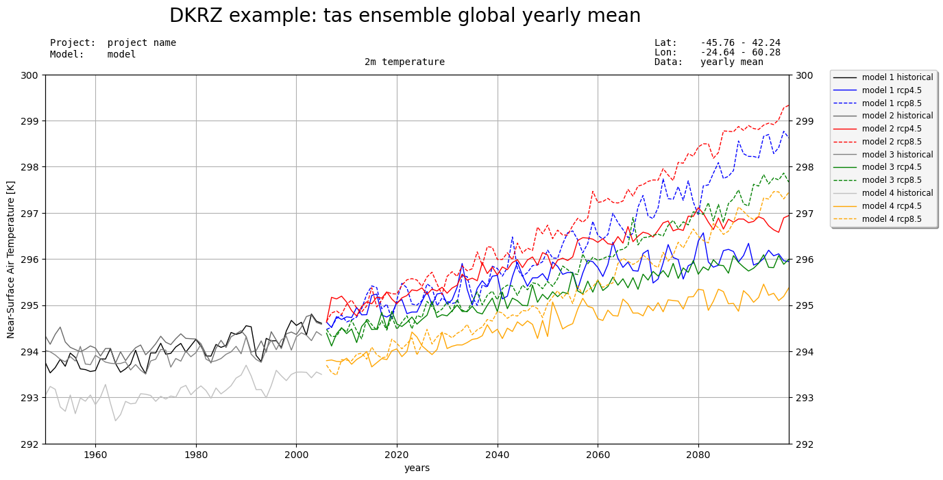
DKRZ example
Plot multiple ensemble means historical, rcp4.5, and rcp8.5
This example demonstrates how to read and plot the time series data of multiple
model files for Historical and RCP-4.5 and RCP-8.5 ensemble runs.
Content
- create multiple line plots in one figure
- add a legend
- add a title
- add x-label and y-label
- save to PNG
-------------------------------------------------------------------------------
2021 copyright DKRZ licensed under CC BY-NC-SA 4.0 <br>
(https://creativecommons.org/licenses/by-nc-sa/4.0/deed.en)
-------------------------------------------------------------------------------
'''
import numpy as np
import xarray as xr
import matplotlib.pyplot as plt
def main():
# Input files
# Data files for model 1
hist_model1 = 'tas_mod1_hist_rectilin_grid_2D.nc'
rcp45_model1 = 'tas_mod1_rcp45_rectilin_grid_2D.nc'
rcp85_model1 = 'tas_mod1_rcp85_rectilin_grid_2D.nc'
# Data files for model 2
hist_model2 = 'tas_mod2_hist_rectilin_grid_2D.nc'
rcp45_model2 = 'tas_mod2_rcp45_rectilin_grid_2D.nc'
rcp85_model2 = 'tas_mod2_rcp85_rectilin_grid_2D.nc'
# Data files for model 3
hist_model3 = 'tas_mod3_hist_rectilin_grid_2D.nc'
rcp45_model3 = 'tas_mod3_rcp45_rectilin_grid_2D.nc'
rcp85_model3 = 'tas_mod3_rcp85_rectilin_grid_2D.nc'
# Data file for model 4
hist_model4 = 'tas_mod4_hist_rectilin_grid_2D.nc'
rcp45_model4 = 'tas_mod4_rcp45_rectilin_grid_2D.nc'
rcp85_model4 = 'tas_mod4_rcp85_rectilin_grid_2D.nc'
# We use Xarray to open the Historical, RCP-4.5, and RCP-8.5 datasets.
ds1_hist = xr.open_dataset('../../data/'+hist_model1)
ds2_hist = xr.open_dataset('../../data/'+hist_model2)
ds3_hist = xr.open_dataset('../../data/'+hist_model3)
ds4_hist = xr.open_dataset('../../data/'+hist_model4)
ds1_rcp45 = xr.open_dataset('../../data/'+rcp45_model1)
ds2_rcp45 = xr.open_dataset('../../data/'+rcp45_model2)
ds3_rcp45 = xr.open_dataset('../../data/'+rcp45_model3)
ds4_rcp45 = xr.open_dataset('../../data/'+rcp45_model4)
ds1_rcp85 = xr.open_dataset('../../data/'+rcp85_model1)
ds2_rcp85 = xr.open_dataset('../../data/'+rcp85_model2)
ds3_rcp85 = xr.open_dataset('../../data/'+rcp85_model3)
ds4_rcp85 = xr.open_dataset('../../data/'+rcp85_model4)
# Time
# Retrieve the years of Historical and RCP runs and create an array containing all.
nyears_hist = ds1_hist.time.size
nyears_rcp = ds1_rcp45.time.size
years = xr.concat([ds1_hist['time.year'], ds1_rcp45['time.year']], dim='time')
# Define colors and line style
colors = {'model1':'blue', 'model2':'red', 'model3':'green', 'model4':'orange'}
colorhist = {'model1':'black', 'model2':'dimgray', 'model3':'gray', 'model4':'silver',}
linestyles = {'line':'-', 'dashdot':'-.', 'dotted':':', 'dashdash':'--'}
linewidth = 1.0
# Define plot settings
times = [years[0:ds1_hist.time.size], years[ds1_hist.time.size:len(years)+1], years[ds1_hist.time.size:len(years)+1]]
styles = [linestyles['line'], linestyles['line'], linestyles['dashdash']]
model1 = [ds1_hist.tas.squeeze(), ds1_rcp45.tas.squeeze(), ds1_rcp85.tas.squeeze()]
labels1 = ['model 1 historical', 'model 1 rcp4.5', 'model 1 rcp8.5']
colors1 = [colorhist['model1'], colors['model1'], colors['model1']]
model2 = [ds2_hist.tas.squeeze(), ds2_rcp45.tas.squeeze(), ds2_rcp85.tas.squeeze()]
labels2 = ['model 2 historical', 'model 2 rcp4.5', 'model 2 rcp8.5']
colors2 = [colorhist['model2'], colors['model2'], colors['model2']]
model3 = [ds3_hist.tas.squeeze(), ds3_rcp45.tas.squeeze(), ds3_rcp85.tas.squeeze()]
labels3 = ['model 3 historical', 'model 3 rcp4.5', 'model 3 rcp8.5']
colors3 = [colorhist['model3'], colors['model3'], colors['model3']]
model4 = [ds4_hist.tas.squeeze(), ds4_rcp45.tas.squeeze(), ds4_rcp85.tas.squeeze()]
labels4 = ['model 4 historical', 'model 4 rcp4.5', 'model 4 rcp8.5']
colors4 = [colorhist['model4'], colors['model4'], colors['model4']]
# Create the plot
plt.switch_backend('agg')
fig, ax = plt.subplots(figsize=(14,7), facecolor='white')
ax.set_facecolor('white')
ax.grid()
ax.set_xlim(years[0],years[-1])
ax.set_ylim(292,300)
ax.set_xlabel('years')
ax.set_ylabel(ds1_hist.tas.long_name+' ['+ds1_hist.tas.units+']')
ax.yaxis.set_ticks_position('both')
ax2 = ax.twinx() # add y-axis annotations to the right
ax2.set_ylim(ax.get_ylim())
for i, model in enumerate(model1):
ax.plot(times[i],
model,
label=labels1[i],
color=colors1[i],
lw=linewidth,
linestyle=styles[i])
for i, model in enumerate(model2):
ax.plot(times[i],
model,
label=labels2[i],
color=colors2[i],
lw=linewidth,
linestyle=styles[i])
for i, model in enumerate(model3):
ax.plot(times[i],
model,
label=labels3[i],
color=colors3[i],
lw=linewidth,
linestyle=styles[i])
for i, model in enumerate(model4):
ax.plot(times[i],
model,
label=labels4[i],
color=colors4[i],
lw=linewidth,
linestyle=styles[i])
# add a legend
legend = ax.legend(loc='center left',
bbox_to_anchor=(1.05,0.8),
handlelength=2.9,
shadow=True,
fontsize='small')
legend.get_frame().set_facecolor('whitesmoke')
# add text
plt.gcf().text(0.5, 0.99, 'DKRZ example: tas ensemble global yearly mean', ha='center', fontsize=20)
plt.gcf().text(0.5, 0.90, '2m temperature', ha='center', fontfamily='monospace', fontsize=10)
# text top left side
plt.gcf().text(0.13, 0.94, 'Project: project name', fontfamily='monospace', fontsize=10)
plt.gcf().text(0.13, 0.915, 'Model: model', fontfamily='monospace', fontsize=10)
# text top right side
plt.gcf().text(0.76, 0.94, 'Lat: -45.76 - 42.24', ha='left', fontfamily='monospace', fontsize=10)
plt.gcf().text(0.76, 0.92, 'Lon: -24.64 - 60.28', ha='left', fontfamily='monospace', fontsize=10)
plt.gcf().text(0.76, 0.90, 'Data: yearly mean', ha='left', fontfamily='monospace', fontsize=10)
plt.savefig('plot_multi_timeseries_example.png', bbox_inches='tight', dpi=100)
if __name__ == '__main__':
main()
Plot result: