Python get pressure extrema#
Software requirements:
Python 3
numpy
scipy
matplotlib
cartopy
Example script#
get_and_add_the_extrema.py
#!/usr/bin/env python
# coding: utf-8
'''
DKRZ example
Get the extrema of surface pressure data
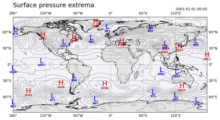
In this example we demonstrate how to locate the extrema (low and high pressure
areas) of a surface pressure field. Therefore, we use the `minimum_filter` and
`maximum_filter` functions from the `scipy.ndimage` package.
The plot shows
- dashed contour lines for the surface pressure data
- the symbols 'L' for the minima and 'H' for the maxima are added
- the extrema values are added below the symbols
-------------------------------------------------------------------------------
2024 copyright DKRZ licensed under CC BY-NC-SA 4.0
(https://creativecommons.org/licenses/by-nc-sa/4.0/deed.en)
-------------------------------------------------------------------------------
'''
import numpy as np
import xarray as xr
from scipy.ndimage import maximum_filter, minimum_filter
import matplotlib.pyplot as plt
import cartopy.crs as ccrs
import cartopy.feature as cfeature
#-------------------------------------------
# Function add_extrema_symbols_and_values()
#-------------------------------------------
def add_extrema_symbols_and_values(ax, data, kind, x, y, **kwargs):
'''Add the symbols and values centered at the extrema coordinates to the
parent axis.
Parameters:
ax parent axis
data data array
kind kind of extrema, "min" or "max"
x,y array-like; the coordinates of the extrema
Other parameters:
symbol symbol to be used for the extrema
default for kind="min": "L" or default for kind="max": "H"
color font color
fntsymbol fontsize used for the symbol
fntvalues fontsize used for the values
'''
if kind not in ['min','max']:
raise NameError(f"Wrong parameter kind='{kind}'. Only 'min' and 'max' are valid.")
#-- default text attributes
dict_min = dict(symbol='L', color='b', fntsymbol=24, fntvalues=12)
dict_max = dict(symbol='H', color='r', fntsymbol=24, fntvalues=12)
if kind == 'min': plot_kw = dict_min
if kind == 'max': plot_kw = dict_max
#-- check the kwargs for new settings
if 'symbol' in kwargs: plot_kw['symbol'] = kwargs['symbol']
if 'color' in kwargs: plot_kw['color'] = kwargs['color']
if 'fntsymbol' in kwargs: plot_kw['fntsymbol'] = kwargs['fntsymbol']
if 'fntvalues' in kwargs: plot_kw['fntvalues'] = kwargs['fntvalues']
for i in range(len(y)):
#-- add the symbol for the extrema to the axis
ax.text(data.lon[x[i]], data.lat[y[i]],
plot_kw['symbol'],
color=plot_kw['color'],
size=plot_kw['fntsymbol'],
clip_on=False, ha='center', va='center',
transform=ccrs.PlateCarree())
#-- add thevalues for the extrema to the axis
ax.text(data.lon[x[i]], data.lat[y[i]],
'\n' + str(int(data[y[i], x[i]])),
color=plot_kw['color'],
size=plot_kw['fntvalues'],
clip_on=False, fontweight='bold',
ha='center', va='top', transform=ccrs.PlateCarree())
#-------------------------------------------
# Function main()
#-------------------------------------------
def main():
# Read data
xr.set_options(keep_attrs=True) #-- keep all attributes
ds = xr.open_dataset('../../data/rectilinear_grid_2D.nc')
#-- coordinates
lon = ds.lon
lat = ds.lat
#-- variable slp, convert to hPa
slp = ds.slp / 100
slp.attrs['units'] = 'hPa'
# Compute extrema
#-- use first time step of data variable
data = slp.isel(time=0)
#-- locate the high pressure areas
#-- size: array shape around each element position to be passed to the filter function
data_ext_max = maximum_filter(data, size=25, mode='nearest')
#-- locate the low pressure areas
data_ext_min = minimum_filter(data, size=25, mode='nearest')
#-- retrieve the coordinates of the extrema
y_ext_max, x_ext_max = np.where(data_ext_max == data)
y_ext_min, x_ext_min = np.where(data_ext_min == data)
# Plotting
plt.switch_backend('agg')
fig, ax = plt.subplots(figsize=(10,5), subplot_kw={'projection':ccrs.PlateCarree()})
#-- add coastlines, gridlines, and color the map background
ax.coastlines('50m', ec='k', lw=0.7)
ax.add_feature(cfeature.LAND, fc='black', alpha=0.1)
ax.add_feature(cfeature.OCEAN, fc='navy', alpha=0.05)
ax.gridlines(draw_labels=True)
#-- create the contour lines plot
line_kw = dict(colors='k', linewidths=0.5, linestyles='dashed')
cnplot = ax.contour(ds.lon, ds.lat, data, levels=20, **line_kw )
#-- add the text symbols and values of the maximum extrema
add_extrema_symbols_and_values(ax=ax,
data=data,
kind='max',
x=x_ext_max,
y=y_ext_max,
fntsymbol=20,
fntvalues=8)
#-- add the text symbols and values of the minimum extrema
add_extrema_symbols_and_values(ax=ax,
data=data,
kind='min',
x=x_ext_min,
y=y_ext_min,
symbol='L',
fntsymbol=20,
fntvalues=8)
ax.set_title('Surface pressure extrema', loc='left', fontsize=18, y=1.08)
ax.set_title(f'{data.time.dt.strftime("%Y-%m-%d %H:%M").values}',
loc='right', y=1.05, fontsize=10)
#-- save plot to PNG file
plt.savefig('plot_add_extrema_symbols.png', bbox_inches='tight')
if __name__ == '__main__':
main()
Plot result#