Python: Streamplot: using another variable to color the streamlines#
Description
In this example we demonstrate how to create streamline plots of u-wind and v-wind variables, and do the coloring by the data of another variable.
Content:
ax_settings: function to do some axis settings
Example data
Set data bounds and create the norm
Plotting - u,v and surface temperature - u,v and sea level pressure - u,v streamplot colored by surface temperature; save PNG - u,v streamplot colored by sea level pressure; save PNG
Software requirements
Python 3
numpy
xarray
matplotlib
cartopy
Example script#
streamlines_colored_by_other_variable.py
#!/usr/bin/env python
# coding: utf-8
#
# Streamplot: using another variable to color the streamlines
#
#------------------------------------------------------------------------------
# 2025 copyright DKRZ licensed under CC BY-NC-ND 4.0
# (https://creativecommons.org/licenses/by-nc-nd/4.0/deed.en)
#------------------------------------------------------------------------------
#
# In this example we demonstrate how to create streamline plots of u-wind and
# v-wind variables, and do the coloring by the data of another variable.
#
# Content:
# - ax_settings: function to do some axis settings
# - Example data
# - Set data bounds and create the norm
# - Plotting
# - u,v and surface temperature
# - u,v and sea level pressure
# - u,v streamplot colored by surface temperature
# - u,v streamplot colored by sea level pressure
#
#------------------------------------------------------------------------------
import os
import numpy as np
import xarray as xr
import matplotlib.pyplot as plt
import matplotlib.colors as mcolors
import matplotlib.colorbar as colorbar
import cartopy.crs as ccrs
import cartopy.feature as cfeature
#------------------------------------------------------------------------------
# ax_settings: function to do some axis settings
#
# To ensure that all plots are displayed in the same way, the most important
# plot settings have been packed into a function.
#------------------------------------------------------------------------------
def ax_settings(ax, title='', title_y=1.01, top=True, bottom=False, right=True,
mfill=False):
ax.set_title(title, y=title_y)
ax.coastlines(lw=0.3, color='k')
gl = ax.gridlines(draw_labels=True)
gl.top_labels = top
gl.right_labels = right
gl.bottom_labels = bottom
if mfill: ax.add_feature(cfeature.LAND, zorder=0, color='gray')
return ax, gl
#-----------------------
#---- function main ----
#-----------------------
def main():
#-- Example data
#
# You can download the example netCDF file from NCL:
# https://www.ncl.ucar.edu/Document/Manuals/NCL_User_Guide/Data/rectilinear_grid_2D.nc
#
# `wget https://www.ncl.ucar.edu/Document/Manuals/NCL_User_Guide/Data/rectilinear_grid_2D.nc`
#
# Read the u, v and surface temperature data of the first time step.
infile = os.environ['HOME'] + '/data/rectilinear_grid_2D.nc'
ds = xr.open_dataset(infile)
u = ds.u10.isel(time=0) #-- 10m u-velocity
v = ds.v10.isel(time=0) #-- 10m v-velocity
t = ds.tsurf.isel(time=0) #-- surface air temperature
print(t.shape)
print(t.min().values, t.max().values)
#-- Set data bounds and create the norm
#
# Choose the minimum and maximum data values of the variable tsurf to
# calculate the bounds and norm for the colors in the contourf and streamplot
# plots.
vmin, vmax = 210, 310
bounds = np.linspace(vmin, vmax, 11)
norm = mcolors.BoundaryNorm(boundaries=bounds, ncolors=256)
#-- Plotting
#
#-- u,v and Surface temperature
#
# Create one figure containing 3 plots:
# - ax1: contourf plot of the data to be used for the colors of the later
# plotted streamlines
# - ax2: streamplot plot of variables u-wind and v-wind
# - ax3: streamplot plot of variables u-wind and v-wind colored by temperature
# variable
# - additional ax4: add an colorbar
#
# Note: The `color` keyword of streamplot takes a color or a 2D array as
# input. The variables used in this example are Xarray DataArrays
# which can't be used as they are. Use the `DataArray.data` that gives
# you the data as an array.
fig, (ax1,ax2,ax3, ax4) = plt.subplots(nrows=4, ncols=1, figsize=(12,12),
layout='constrained',
subplot_kw=dict(projection=ccrs.PlateCarree()))
#-- set colormap
cmap = 'RdBu_r'
#-----------------------------------------------------------
#-- ax1: create the contour plot of temperature data
#-----------------------------------------------------------
ax1, gl1 = ax_settings(ax1, title=f'{t.long_name}', title_y=1.07,
right=False, bottom=False)
cont = ax1.contourf(ds.lon, ds.lat, t, levels=bounds, norm=norm, cmap=cmap)
#-----------------------------------------------------------
#-- ax2: create the streamplot
#-----------------------------------------------------------
ax2, gl2 = ax_settings(ax2, title=f'streamplot u,v', top=False, right=False)
ax2.coastlines(color='black', linewidth=0.7)
stream1 = ax2.streamplot(ds.lon, ds.lat, u, v,
color='gray',
linewidth=0.5,
density=[2, 2])
#-----------------------------------------------------------
#-- ax3: create the streamplot colored the other variable
#-----------------------------------------------------------
ax3, gl3 = ax_settings(ax3, title=f'streamplot u,v colored by temperature',
top=False, bottom=True, right=False, mfill=True)
stream2 = ax3.streamplot(ds.lon, ds.lat, u, v,
color=t.data,
cmap=cmap,
norm=norm,
linewidth=0.9,
density=[2, 2])
#-----------------------------------------------------------
#-- ax4: add a colorbar at the bottom of all plots
#-----------------------------------------------------------
ax4.set_visible(False)
bbox = ax4.get_position()
x, y = bbox.x0, bbox.y0
w, h = bbox.width, bbox.height
cax = fig.add_axes([0.36, 2.*y, w+w/1.5, h*0.06], autoscalex_on=False)
cbar = colorbar.Colorbar(cax, orientation='horizontal', cmap=cmap, norm=norm,
label=f'{t.long_name} [K]')
plt.show()
#-- u,v and sea level pressure
#
# Create one figure containing 3 plots:
# - ax1: contourf plot of the data to be used for the colors of the later
# plotted streamlines
# - ax2: streamplot plot of variables u-wind and v-wind
# - ax3: streamplot plot of variables u-wind and v-wind colored by sea level
# pressure variable
# - additional ax4: add an colorbar
#
# Read the sea level pressure data of the first time step and convert it to
# units hPa.
slp = ds.slp.isel(time=0) #-- sea level pressure in Pa
slp = slp/100
slp.attrs['units'] = 'hPa'
slp.attrs['long_name'] = 'sea level pressure'
print(slp.shape, slp.min().values, slp.max().values, slp.units)
# Adapt the bounds and norm for the sea level pressure variable slp.
vmin1, vmax1 = 950, 1050
bounds1 = np.linspace(vmin1, vmax1, 11)
norm1 = mcolors.BoundaryNorm(boundaries=bounds1, ncolors=256)
# Create the plots.
fig, (ax1,ax2,ax3, ax4) = plt.subplots(nrows=4, ncols=1, figsize=(12,12),
layout='constrained',
subplot_kw=dict(projection=ccrs.PlateCarree()))
#-- set colormap
cmap1 = 'coolwarm_r'
#-----------------------------------------------------------
#-- ax1: create the contour plot of temperature data
#-----------------------------------------------------------
ax1, gl1 = ax_settings(ax1, title=f'{slp.long_name}', title_y=1.07,
right=False, bottom=False)
cont = ax1.contourf(ds.lon, ds.lat, slp, levels=bounds1, norm=norm1, cmap=cmap1)
#-----------------------------------------------------------
#-- ax2: create the streamplot
#-----------------------------------------------------------
ax2, gl2 = ax_settings(ax2, title=f'streamplot', top=False, right=False)
ax2.coastlines(color='black', linewidth=0.7)
stream1 = ax2.streamplot(ds.lon, ds.lat, u, v,
color='gray',
linewidth=0.5,
density=[2, 2])
#-----------------------------------------------------------
#-- ax3: create the streamplot colored the other variable
#-----------------------------------------------------------
ax3, gl3 = ax_settings(ax3, title=f'streamplot colored by {slp.long_name}',
top=False, bottom=True, right=False, mfill=False)
ax3.coastlines(color='black', linewidth=0.7)
stream2 = ax3.streamplot(ds.lon, ds.lat, u, v,
color=slp.data,
cmap=cmap1,
norm=norm1,
linewidth=1.,
density=[3, 3])
#-----------------------------------------------------------
#-- ax4: add a colorbar at the bottom of all plots
#-----------------------------------------------------------
ax4.set_visible(False)
bbox = ax4.get_position()
x, y = bbox.x0, bbox.y0
w, h = bbox.width, bbox.height
cax = fig.add_axes([0.36, 2.*y, w+w/1.5, h*0.06], autoscalex_on=False)
cbar = colorbar.Colorbar(cax, orientation='horizontal', cmap=cmap1, norm=norm1,
label=f'{slp.long_name} [{slp.units}]')
plt.show()
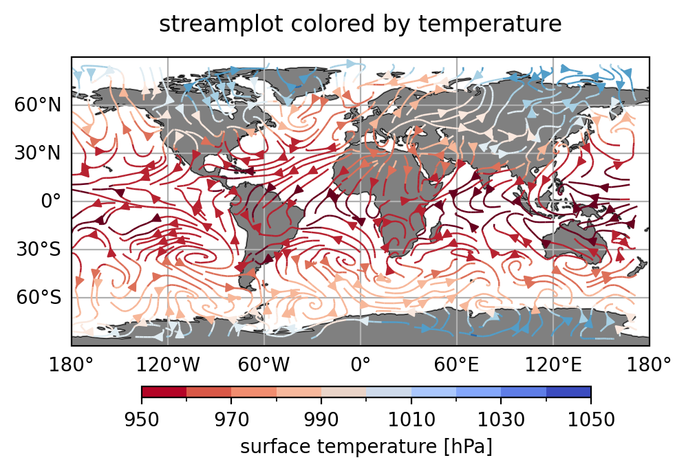
#-- u,v streamplot colored by surface temperature
#
# Create the last plot of the first panel plot and save it to a PNG file.
fig, (ax1,ax2) = plt.subplots(nrows=2, ncols=1, figsize=(12,6),
subplot_kw=dict(projection=ccrs.PlateCarree()))
#-----------------------------------------------------------
#-- ax1: create the streamplot colored the other variable
#-----------------------------------------------------------
ax1, gl1 = ax_settings(ax1, title=f'streamplot colored by temperature',
title_y=1.05, top=False, bottom=True, right=False,
mfill=True)
stream = ax1.streamplot(ds.lon, ds.lat, u, v,
color=t.data,
cmap=cmap,
norm=norm,
linewidth=0.9,
density=[2, 2])
ax2.set_visible(False)
bbox = ax2.get_position()
x, y = bbox.x0, bbox.y0
w, h = bbox.width, bbox.height
cax = fig.add_axes([0.38, 4.25*y, w+w/1.8, h*0.04], autoscalex_on=False)
cbar = colorbar.Colorbar(cax, orientation='horizontal', cmap=cmap1, norm=norm1,
label=f'{t.long_name} [{slp.units}]')
plt.savefig('plot_streamlines_colored_1.png', bbox_inches='tight',
facecolor='white', dpi=200)
plt.show()
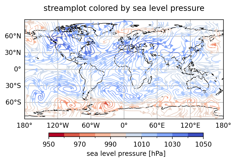
#-- u,v streamplot colored by sea level pressure
#
# Create the last plot of the second panel plot and save the plot to a PNG file.
fig, (ax1,ax2) = plt.subplots(nrows=2, ncols=1, figsize=(12,6),
subplot_kw=dict(projection=ccrs.PlateCarree()))
#-----------------------------------------------------------
#-- ax1: create the streamplot colored the other variable
#-----------------------------------------------------------
ax1, gl = ax_settings(ax1, title=f'streamplot colored by {slp.long_name}',
title_y=1.05, top=False, bottom=True, right=False,
mfill=False)
ax1.coastlines(color='black', linewidth=0.7)
stream = ax1.streamplot(ds.lon, ds.lat, u, v,
color=slp.data,
cmap=cmap1,
norm=norm1,
linewidth=1.,
density=[3, 3])
ax2.set_visible(False)
bbox = ax2.get_position()
x, y = bbox.x0, bbox.y0
w, h = bbox.width, bbox.height
cax = fig.add_axes([0.38, 4.25*y, w+w/1.8, h*0.04], autoscalex_on=False)
cbar = colorbar.Colorbar(cax, orientation='horizontal', cmap=cmap1, norm=norm1,
label=f'{slp.long_name} [{slp.units}]')
plt.savefig('plot_streamlines_colored_2.png', bbox_inches='tight',
facecolor='white', dpi=200)
plt.show()
#---- end main ----
#-- call main
if __name__ == "__main__":
main()
Plot result#