Python sunshine duration colored by temperature#
Software requirements:
Python 3
numpy
pandas
matplotlib
Example script#
sunshine_duration_data_colored_by_temperature.py
#!/usr/bin/env python
# coding: utf-8
'''
DKRZ example
Color bars by another variable
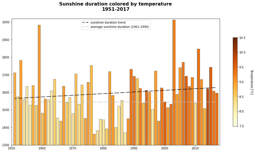
Yearly averages for Germany (DWD):
- Sunshine duration [h]
- Temperature [°C]
Average reference sunshine suration per year 1961-1990: 1544 hours
Content
- read the CSV data
- create new DataFrame
- compute the average temperature for a 30-years reference
- compute the linear regression of the temperature
- create the bar plot
- color the bars for the yearly sunshine duration data by temperature data
-------------------------------------------------------------------------------
2023 copyright DKRZ licensed under CC BY-NC-SA 4.0
(https://creativecommons.org/licenses/by-nc-sa/4.0/deed.en)
-------------------------------------------------------------------------------
'''
import pandas as pd
import numpy as np
import matplotlib.pyplot as plt
from matplotlib.cm import ScalarMappable
import matplotlib.colors as mcolors
def main():
# Read the CSV data
#
# Sunshine duration
file_sun = '../../data/annual_sunshine_duration_regional_averages_sd_year.txt'
file_temp = '../../data/annual_air_temperature_mean_regional_averages_tm_year.txt'
df_sun = pd.read_csv(file_sun, skiprows=[0], sep=';', usecols=['#Jahr','Deutschland'])
# Get the number of years of the sunshine duration dataset.
nyears = df_sun.shape[0]
# Temperature
df_temp = pd.read_csv(file_temp, skiprows=[0], sep=';', usecols=['#Jahr','Deutschland'])
# Since the temperature dataset contains more timesteps we have to select the same times as for the sunshine data. Furthermore, we have to reset the index of the selected data frame to 0.
df_temp2 = df_temp.loc[df_temp['#Jahr'] >= 1951]
df_temp2.reset_index(inplace=True)
# Temperature min and max
print(str(df_temp2['Deutschland'].min()) + ' - ' + str(df_temp2['Deutschland'].max()))
# Reference average temperature
#
# Compute the average temperature for a 30-years reference time (1961-1990).
refdata = round(df_sun['Deutschland'].loc[(df_sun['#Jahr'] >= 1961) & (df_sun['#Jahr'] <= 1990)])
sun_avg = round(np.sum(refdata)/30)
# Create new DataFrame
#
# Merge the data of the sunshine duration and temperature into a new DataFrame.
data = [[df_sun['#Jahr'][i], df_sun['Deutschland'][i], df_temp2['Deutschland'][i]] for i in range(0,nyears)]
df = pd.DataFrame(data, columns=['Jahr','Sunshine','Temperature'])
# Linear regression
#
# Compute the linear regression of the sunshine duration data:
#
# ```python
# sun_trend = np.polynomial.Polynomial.fit(df.Jahr, df.Sunshine, deg=1)
# sun_trend = sun_trend.convert()
# ```
#
# or
#
# ```python
# coef = np.polyfit(df.Jahr, df.Sunshine, deg=1)
# sun_trend = np.poly1d(coef)
# ```
coef = np.polyfit(df.Jahr, df.Sunshine, deg=1)
sun_trend = np.poly1d(coef)
# Create the plot
plt.switch_backend('agg')
fig, ax = plt.subplots(figsize=(16,8))
ax.set_title('Sunshine duration colored by temperature\n1951-2017',
fontsize=16,
fontweight='bold',
y=1.05)
colormap = 'YlOrBr' #'RdYlBu_r'
cmap = plt.cm.get_cmap(colormap)
cmap_short = mcolors.LinearSegmentedColormap.from_list(
'trunc({n},{a:.2f},{b:.2f})'.format(n=cmap.name, a=0.2, b=0.8),
cmap(np.linspace(0.2, 0.8, 10)))
sun_min = 7.5
sun_max = 10.5
c = [(x-sun_min) / (sun_max-sun_min) for x in df.Temperature]
colors = cmap_short(c)
ax.set_xlim([df['Jahr'][0]-1, df['Jahr'][nyears-1]+1])
ax.set_ylim([1300, 2020])
plot = ax.bar(df.Jahr,
df.Sunshine,
color=colors,
edgecolor='black',
linewidth=0.5)
sm = ScalarMappable(cmap=cmap, norm=plt.Normalize(sun_min,sun_max))
sm.set_array([])
cbar = plt.colorbar(sm, shrink=0.7)
cbar.set_label('Temperature [°C]', rotation=270, labelpad=25)
ax.plot(df.Jahr, sun_trend(df.Jahr),
linestyle=(5, (10, 3)),
linewidth=1.5,
color='black',
label='sunshine duration trend')
ax.plot([df.Jahr[0],df.Jahr[nyears-1]], [sun_avg,sun_avg],
linestyle=(5, (10, 3)),
linewidth=1.5,
color='silver',
label='average sunshine duration (1961-1990)')
plt.legend()
plt.savefig('plot_sunshine_duration_colored_by_temperature.png',
bbox_inches='tight',
facecolor='white')
if __name__ == '__main__':
main()
Plot result#