Python warming stripes and trend#
Software requirements:
Python 3
numpy
pandas
matplotlib
Example script#
warming_stripes_with_timeseries_and_trend.py
#!/usr/bin/env python
# coding: utf-8
'''
DKRZ example
Warming stripes plot II
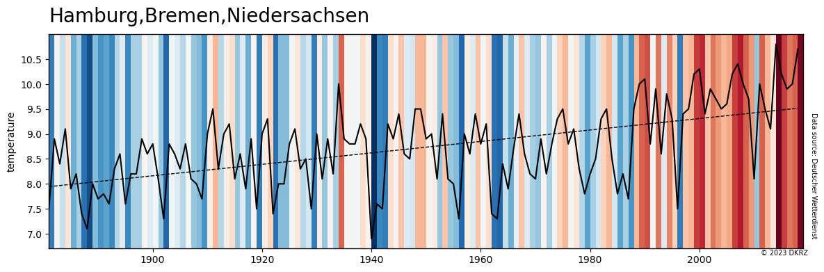
Most of us have already come across Ed Hawkins' depiction of the
'Warming Stripes'. In this example we show how to create this plot with
Python using the annual mean temperature data from the DWD.
The goal is to generate the Warming Stripes for the German states Hamburg,
Bremen, and Nidersachsen and additionally to draw the time series and
trend data.
Content
- read CSV data file
- use Rectangle and PatchCollection to generate the warmin stripes plot
- add the time series data
- add the trend data
Data
- from Deutscher Wetterdienst (German Weather Service), Climate Data Center (CDC)
https://www.dwd.de/DE/leistungen/zeitreihen/zeitreihen.html
Based on
- Ed Hawkins' 'Temperature changes around the world (1901-2018)'
https://showyourstripes.info/s/globe
-------------------------------------------------------------------------------
2023 copyright DKRZ licensed under CC BY-NC-SA 4.0
(https://creativecommons.org/licenses/by-nc-sa/4.0/deed.en)
-------------------------------------------------------------------------------
'''
import numpy as np
import pandas as pd
import matplotlib.pyplot as plt
from matplotlib.patches import Rectangle
from matplotlib.collections import PatchCollection
def main():
# Input data
input_file = '../../data/Hamburg_Bremen_Niedersachsen_Temperature_Anomaly_1881-2018_ym.txt'
state = 'Hamburg,Bremen,Niedersachsen'
df = pd.read_csv(input_file, skiprows=range(0,23), usecols=['#', 'Gebietsmittel'], sep=' ')
df.columns = ['Jahr', 'temperature']
# Define x-axis limits
start_year = df.Jahr[0]
end_year = df.Jahr[df.Jahr.count()-1]
# Create the plot
plt.switch_backend('agg')
fig,ax = plt.subplots(figsize=(14, 4))
cmap = 'RdBu_r'
rect_coll = PatchCollection([Rectangle((y, 0), 1, 1) for y in range(start_year, end_year + 1)], zorder=2)
rect_coll.set_array(df.temperature)
rect_coll.set_cmap(cmap)
ax.add_collection(rect_coll)
ax.set_ylim(0, 1)
ax.set_xlim(start_year, end_year + 1)
ax.yaxis.set_visible(False)
ax.set_title(state, fontsize=20, loc='left', y=1.03)
ax2 = ax.twinx()
ax2.plot(df.Jahr, df.temperature, color='black', linewidth=1.5, )
ax2.yaxis.tick_left()
ax2.yaxis.set_label_position('left')
ax2.set_ylabel('temperature')
ax3 = ax2.twinx()
ax3.set_ylim(ax2.get_ylim())
ax3.yaxis.set_visible(False)
coef = np.polyfit(df.Jahr, df.temperature, 1)
trend = np.poly1d(coef)
ax3.plot(df.Jahr, trend(df.Jahr), linestyle='--', color='black', linewidth=1, )
plt.figtext(0.856, 0.087, '© 2023 DKRZ', fontsize=7)
plt.figtext(0.907, 0.15, 'Data source: Deutscher Wetterdienst',
rotation=270, fontsize=7)
plotfile = 'plot_warming_stripes_plus_timeseries_and_trend.png'
fig.savefig(plotfile, bbox_inches='tight', facecolor='white')
if __name__ == '__main__':
main()
Plot result#